My friend Jim Bianco recently published a discussion of the post-COVID shock, with 11 key charts. Jim has kindly given me permission to reproduce the entire pdf.
Here’s a quick summary. The entire 10-page piece follows the summary.
Jim Bianco discusses lasting economic changes post-COVID, focusing on inflation, market dynamics, and recession indicators. He notes:
Recessions and financial crises can have profound, lasting impacts on the economy. The economy post-COVID is different from the pre-COVID economy of 2019.
Year-over-year change in Consumer Price Index shows higher inflation and volatility post-COVID. Average inflation from January 1992 to March 2020 was 2.28%, while post-COVID average is 4.09%. Core inflation averages: pre-COVID 2.29%, post-COVID 3.88%.
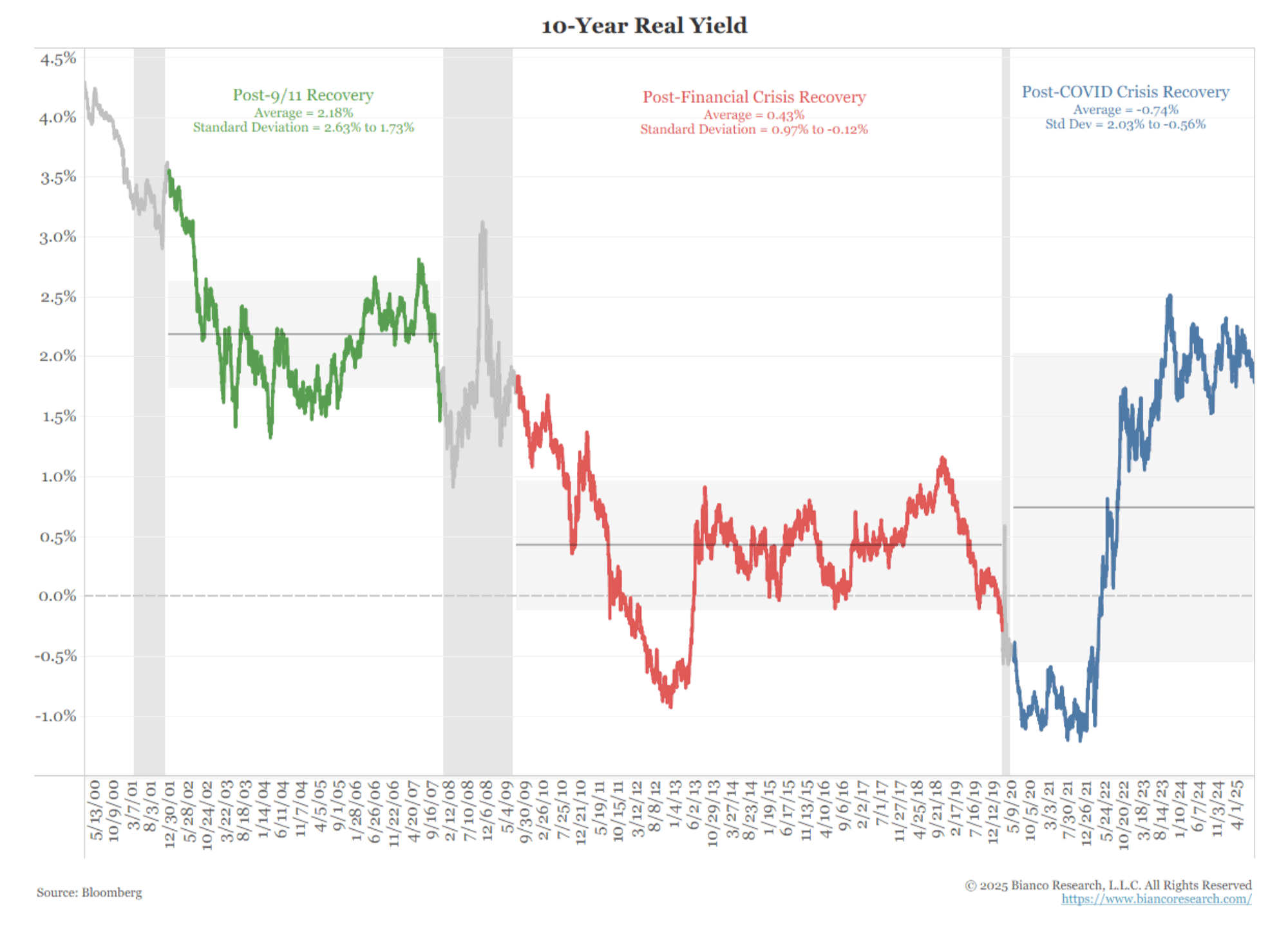
10-year real yields have increased, indicating higher inflation expectations. Five-year TIPS inflation break-even rate remains elevated post-COVID. Real funds rate is around 2%, suggesting a neutral funds rate of at least 4%.
The Leading Economic Index (LEI) peaked in December 2021 and has declined for 39 of the last 41 months. A streak of 23 declines since 2022 suggests a potential recession, but the economy has not shown signs of one. Jim notes that traditional economic models may not apply in the post-COVID cycle.
In our new book, The Fed and the Flu: Parsing Pandemic Economic Shocks, my co-authors and I discuss how pandemics, epidemics, and plagues deliver shocks that change the economic, monetary, and inflation dynamics every time they occur. We have an entire section on the Fed and US history from the 1918 Spanish Flu through COVID. And we have references to 800 years of the Bank of England’s database history, along with corroborating evidence from pandemics and epidemics stretching into antiquity. In every case distinctive shock effects follow pandemics and can be documented.
We also want to refer readers to our July 20 Kotok Report, “Wars Vs Pandemics: Economics, Finance, Investment,” https://kotokreport.com/wars-vs-pandemics/. In that commentary, I discussed a pandemic shock morphing into a war scenario, with differing economic characteristics.
We thank Jim for giving us permission to share his work with our readers. Here’s Jim.
Bianco Research, L.L.C. Charts of the Week August 29th, 2025
Financial Crises and Recessions Change Things
We have argued that recessions and financial crises can have a profound and lasting impact on an economy for years to come. We had both in 2020. This changed the economy. Change does not mean worse or dystopian. It means different. This economy is different from the 2019 (pre-COVID) version.
What follows is a series of charts illustrating the changes that have occurred from pre-COVID to post-COVID.
Inflation Changed
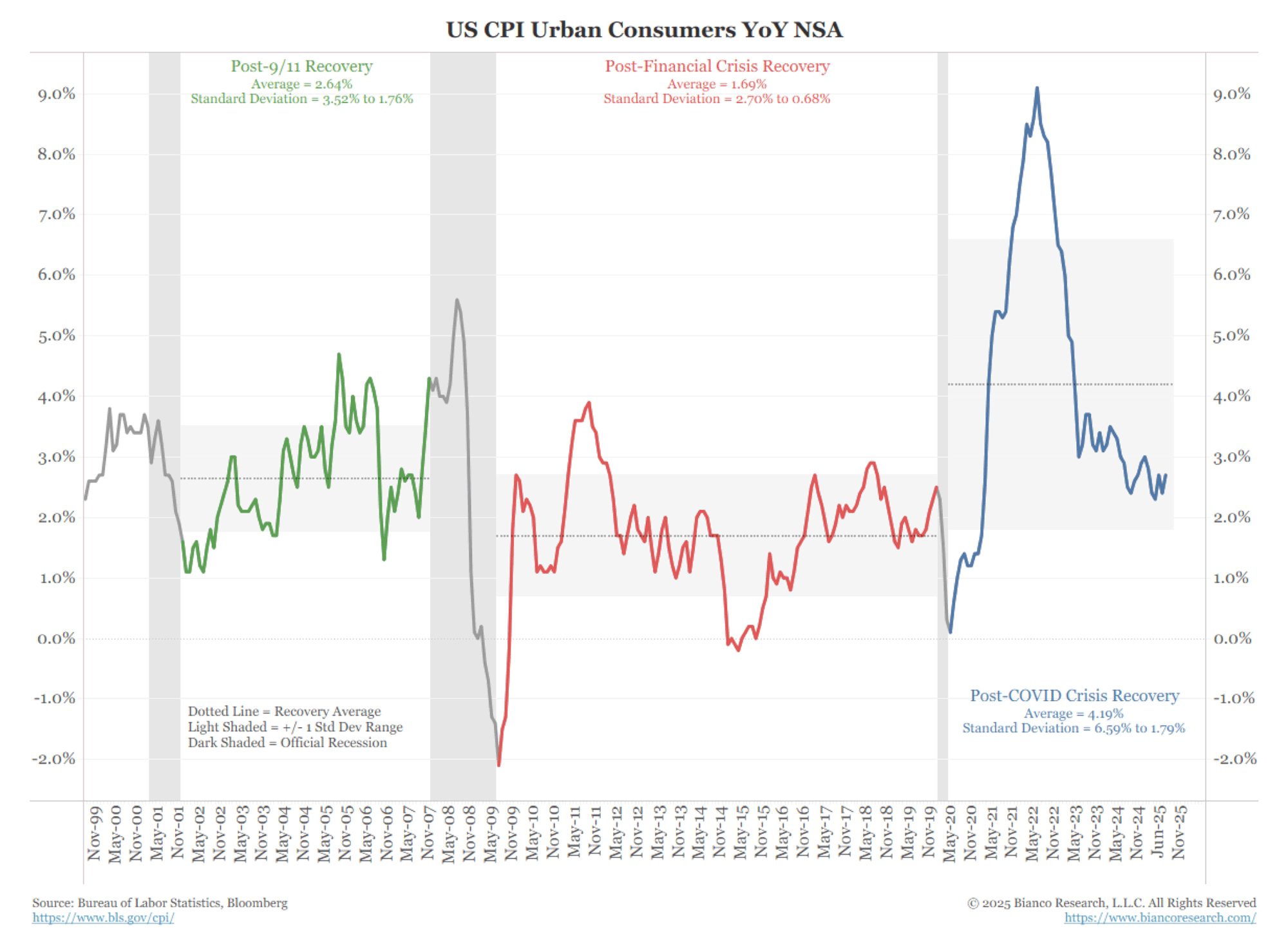
The following chart illustrates the year-over-year change in the Consumer Price Index, which is color-coded.
The dotted horizontal line is the average for that recovery. The shaded area is the standard deviation (66% of the readings in a normally distributed series would be in the shaded area).
This chart illustrates how, following every recession, the tenor of inflation shifts. The current post-COVID recovery, as shown in blue, indicates inflation has reached a significantly higher level, with more volatility (wider standard deviation) than during the post-financial crisis period.
Figure 1. US CPI Urban Consumers YoY NSA
(Click here to view a larger version of this chart.)
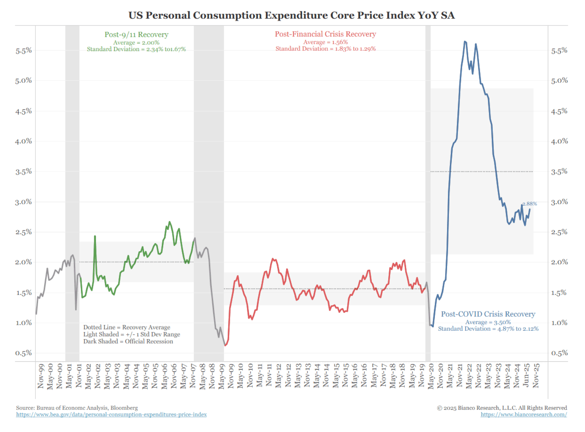
This is even more pronounced in the Fed’s preferred metric of inflation, the Core Personal Consumption Expenditure (PCE).
Figure 2. US Personal Consumption Expenditure Core Price Index YoY SA
(Click here to view a larger version of this chart.)
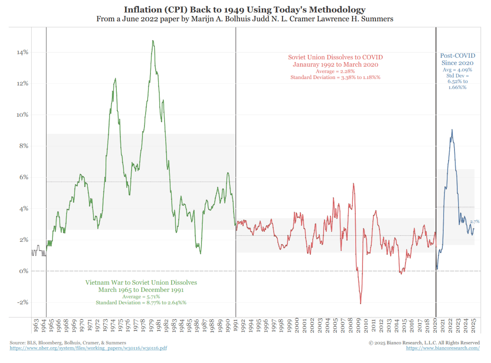
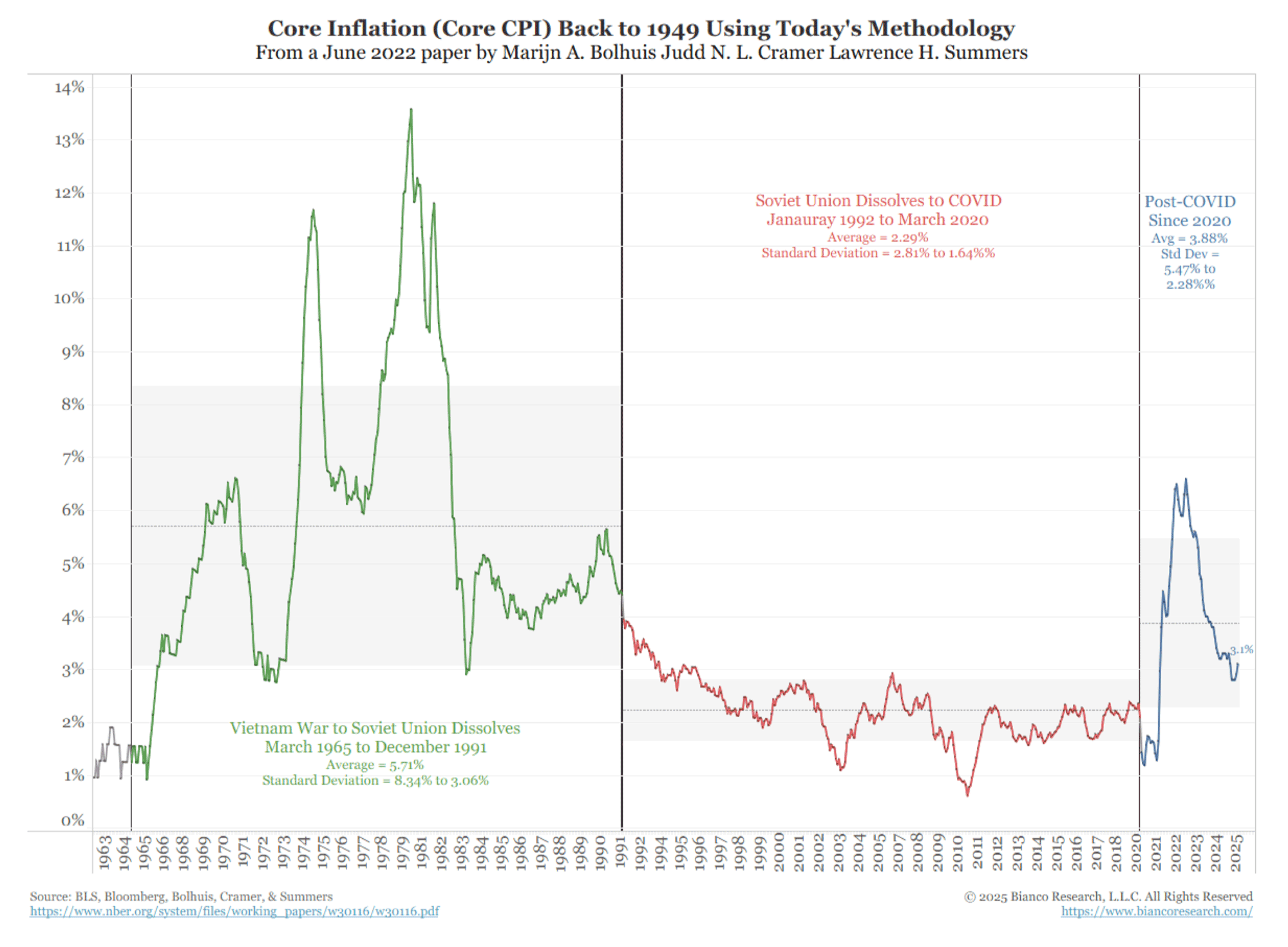
However, something more may be at play, as larger trends in inflation seem to have shifted with the COVID pandemic, as the following two charts illustrate.
Note that these series are inflation rates using today’s methodology, as outlined in a June 2022 paper by Marijn A. Bolhuis, Judd N. L. Cramer, and Lawrence H. Summers.
Figure 3. Inflation (CPI) Back to 1947 Using Today’s Methodology
(Click here to view a larger version of this chart.)
Figure 4. Core Inflation (Core CPI) Back to 1949 Using Today’s Methodology
(Click here to view a larger version of this chart.)
Impact on Inflation Expectations and Real Rates
The impact of the inflation charts above is evident in the markets, as shown below.
It’s a 20-year decline in 10-year real yields (inflation-adjusted) through the post-9/11 recovery, and the financial crisis recovery has ended. As the blue line indicates, the average is now higher than it was during the previous recovery, and volatility is significantly greater (as shown by the standard deviation band).
Figure 5. 10-Year Real Yield
(Click here to view a larger version of this chart.)
Driving these higher yields is the expectation of higher inflation.
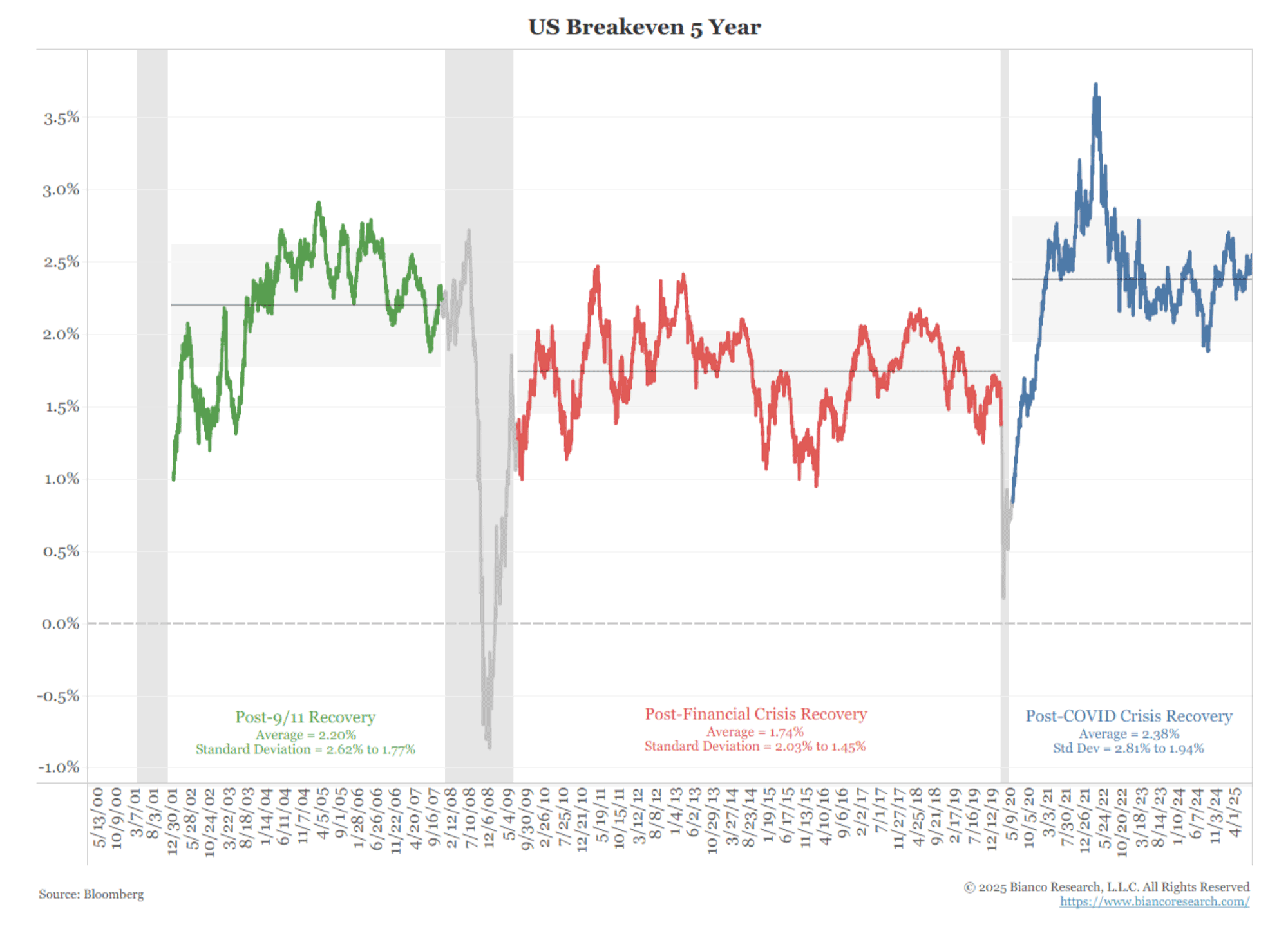
As the inflation charts above show, we’ve had several years of elevated inflation. The following chart shows the five-year Treasury Inflation-Protected Securities (TIPS) inflation break-even rate. That is the five-year yield less the five-year real yield from the TIPS market.
It remains elevated in the post-COVID.
Figure 6. US Breakeven 5 Year
(Click here to view a larger version of this chart.)
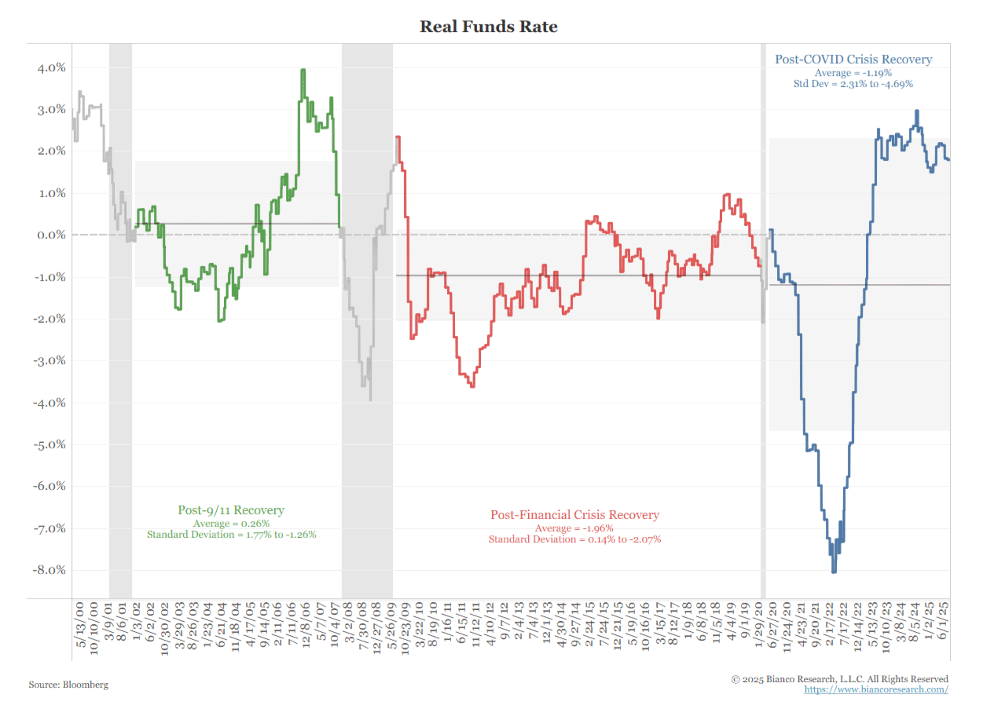
Finally, while the real funds rate has been highly volatile in the post-COVID period, it is settling at around 2%. This would imply a neutral funds rate of at least 4% if the Fed could hit its 2% target. The problem is, as the inflation charts show above, they’re nowhere close to their 2% target.
This implies the Fed is not nearly as restrictive as they think they are. And if they’re about to go into another round of cutting rates, they could easily go into stimulative territory, fostering fears of even more inflation.
Figure 7. Real Funds Rate
(Click here to view a larger version of this chart.)
Measuring the Economy
The two chart sections above illustrate that inflation has changed, and this shift has altered the market dynamics. This has been difficult for people to understand because the basic measurement of the economy is becoming more complicated than usual.
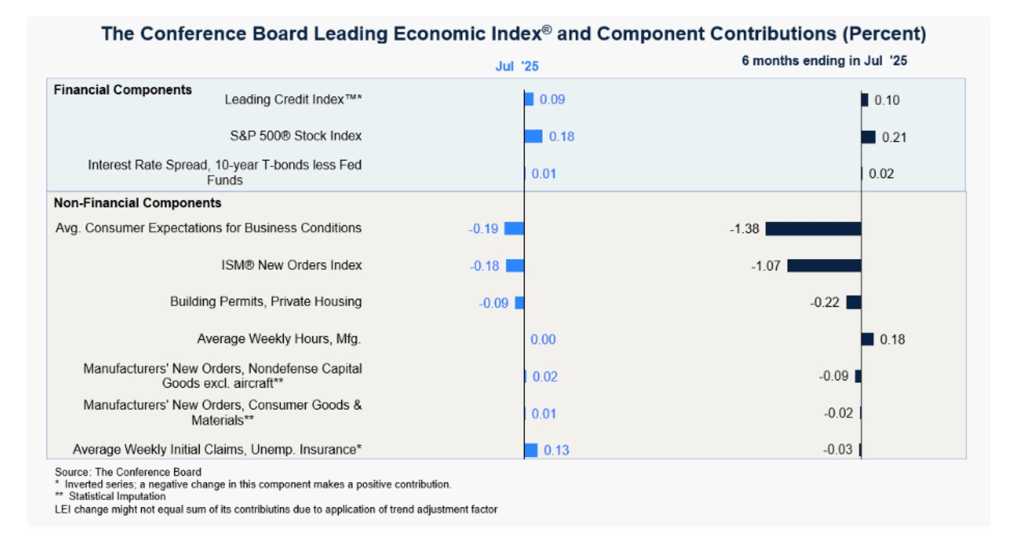
The Confidence Board’s Index of Leading Economic Indicators (LEI). It is an index of ten economic indicators designed to predict the next movement in the economy.
Figure 8. The Conference Board Leading Economic Index and Component Contributions (Percent)
(Click here to view a larger version of this chart.)
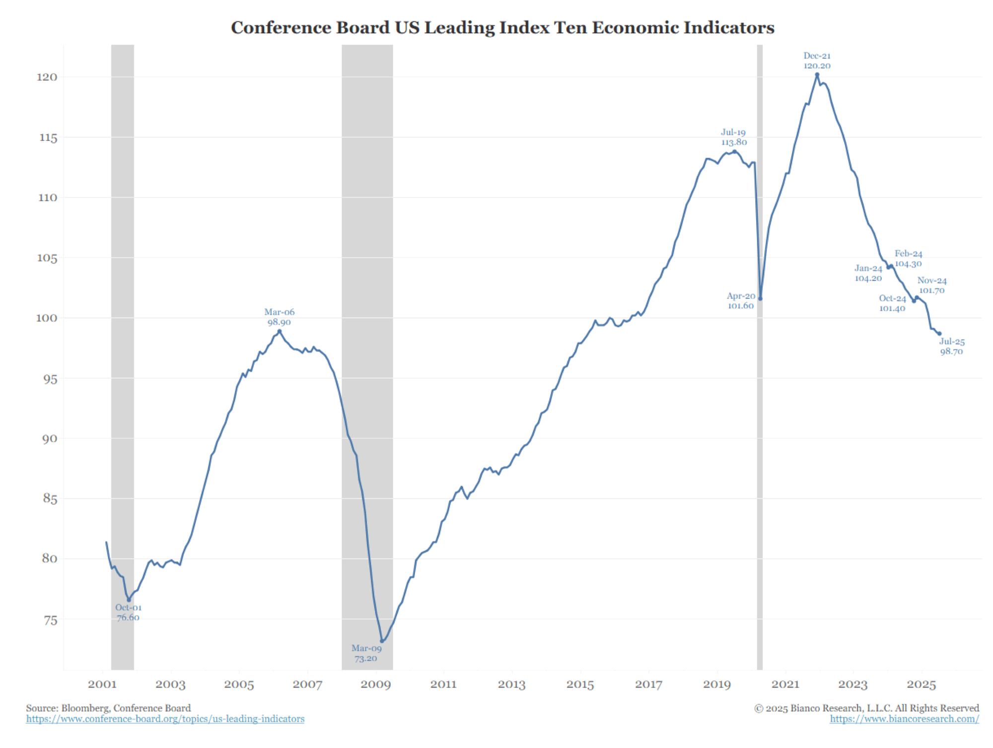
This index peaked in December 2021.
Figure 9. Conference Board US Leading Index Ten Economic Indicators
(Click here to view a larger version of this chart.)
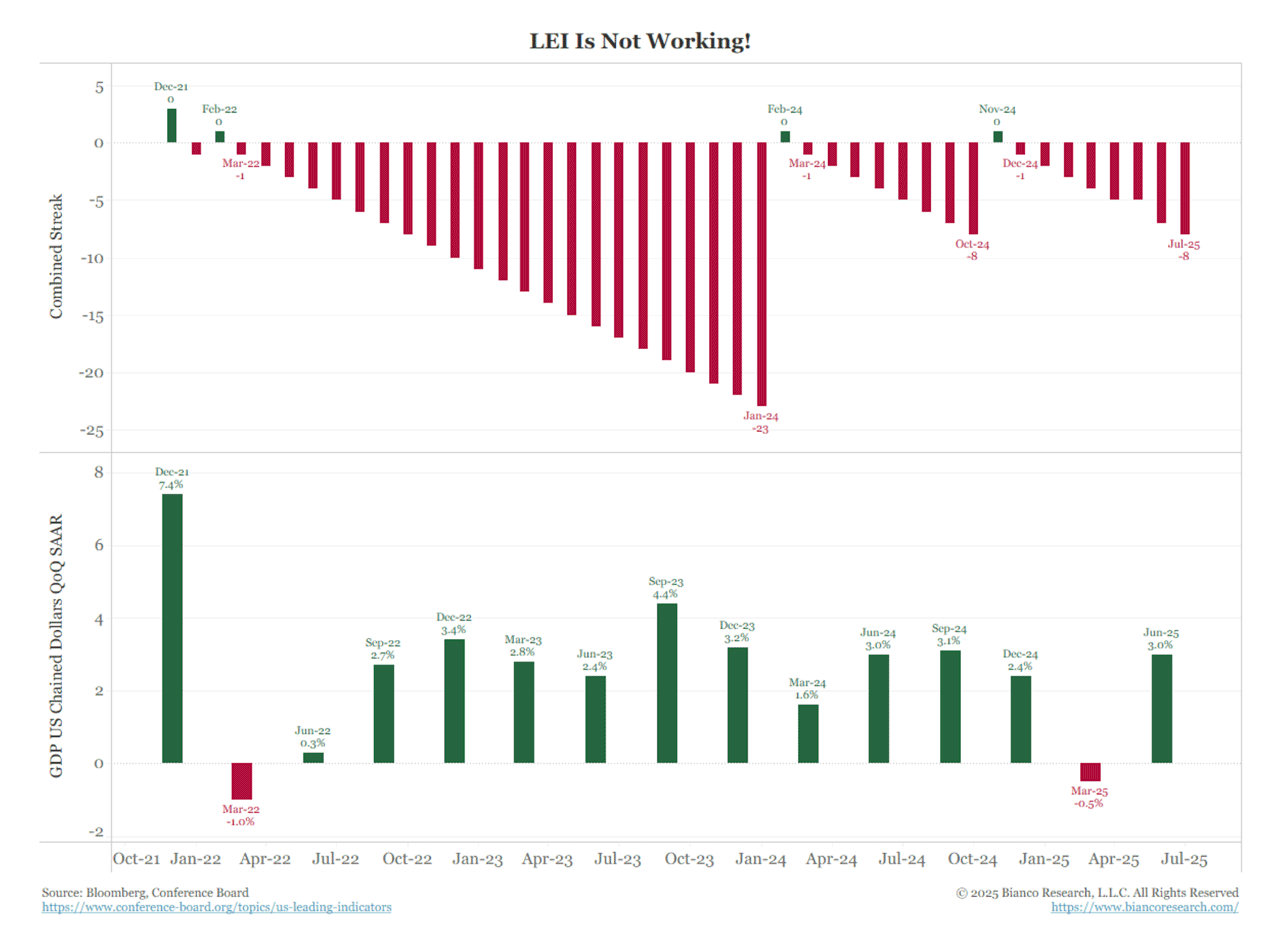
As the top panel below shows, starting in February 2022, the decline has been sustained in 39 of the last 41 months.
Figure 10. LEI Is Not Working!
(Click here to view a larger version of this chart.)
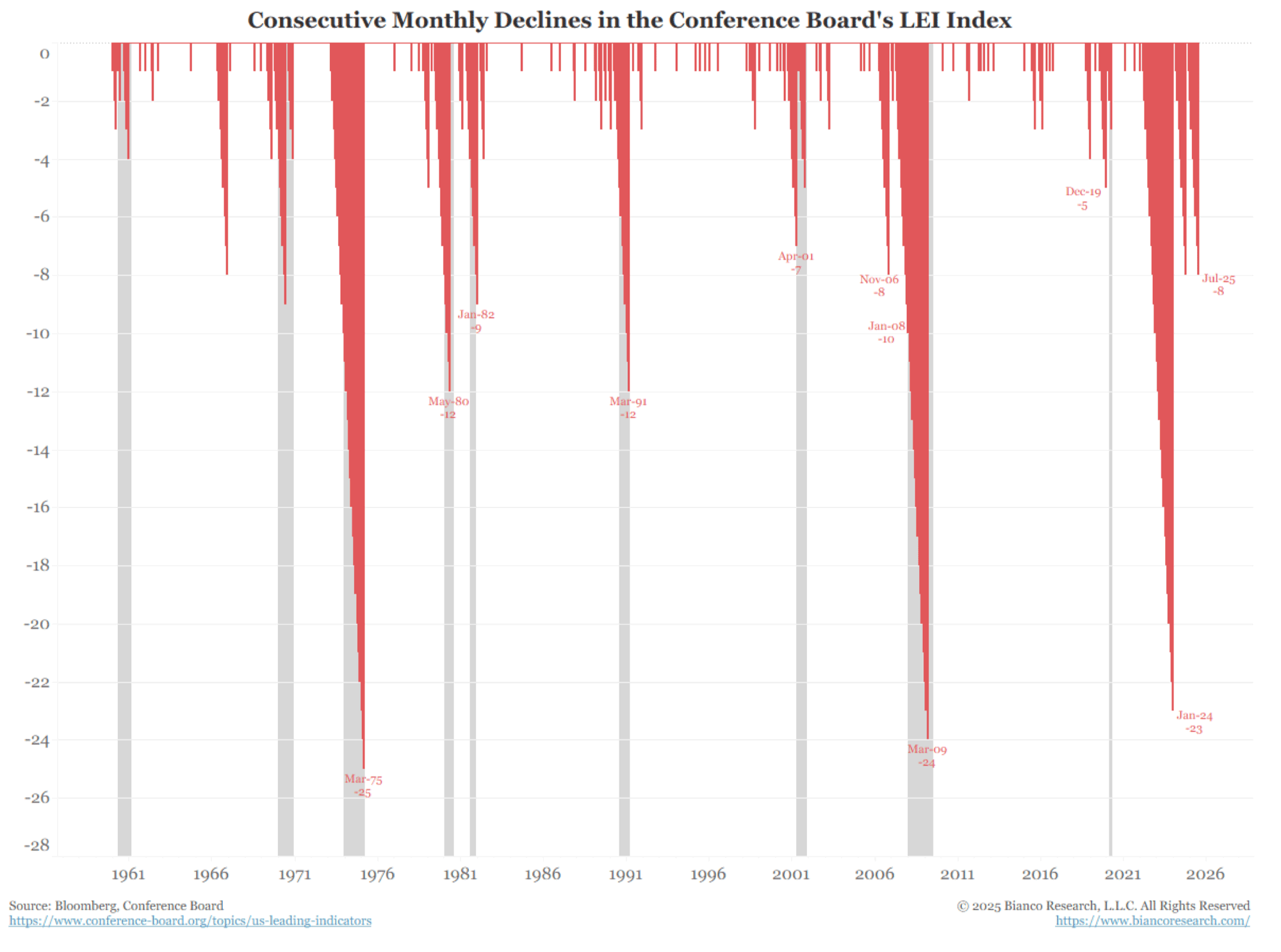
The following chart above goes back to 1960. The shaded areas are recessions. A streak of declines of at least seven months has historically been a predictor of a recession. The longest streak before a recession was ten months in January 2008, when the Great Recession started.
Since 2022, this indicator has experienced a streak of declines totaling 23 (as of January 2024), 8 (as of October 2024), and is currently on another streak of 8 declines (as of July 2025).
Any one of these three should signal the start of a recession. However, the bottom panel in the chart above indicates the economy hasn’t been close to a recession.
Figure 11. Consecutive Monthly Declines in the Conference Board’s LEI Index
(Click here to view a larger version of this chart.)
We often highlight the quote:
“All models are wrong, but some are useful” – UK statistician George Box.
We are not going back to 2019. That was the “pre-COVID” cycle. We are now in the “post-COVID” cycle. This is why data dependence does not work. You must assume a set of relationships between the economy and its measures, such as payrolls, inflation, and retail sales. However, if the economy is shocked by a change, like in 2020, these relationships will not work in the new cycle.
Jeanine Pirro’s criminal investigation of Fed Chair Jerome Powell over a long-term, publicly reviewed Fed building project and over Powell’s related testimony is dominating the headlines. We assess market reactions and implications.


